Smart Input Icons
Unity Asset
Smart Input Icons is a Unity tool that automatically adapts input prompts to the current input. Instead of manually swapping graphics, the system detects whether the player is using PC, Xbox, PlayStation, Switch, or a custom controller and shows the correct icon on screen. It supports both singleplayer and multiplayer setups, comes with a large library of ready-to-use sprites, and integrates seamlessly with UI Images and TextMeshPro.
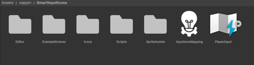
Compatible with Unity 6, 2023.2, 2022.3 LTS, and 2021.3 LTS, it works with the New Input System and supports Built-in, URP, and HDRP pipelines with no extra setup. The asset includes 3 sample scenes. Core content is organized into the Scripts folder (scripts), Icons folder (sprites), and SpriteAssets folder (TextMeshPro sprite assets).
External Packages
Smart Input Icons uses TextMeshPro as the preferred text renderer. For Unity 2021.3 LTS and 2022.3 LTS, installation from the Package Manager is required. Starting with Unity 2023.2, TextMeshPro is included by default, so no manual import is needed.
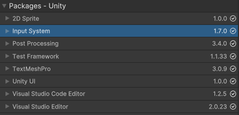
The asset relies on Unity’s New Input System to handle both singleplayer and multiplayer.
Installation of the official Input System package is required via the Package Manager.
Input Setup
Smart Input Icons requires Unity’s New Input System.
After installing the Input System package from the Package Manager,
remember to set it as the default Input Handling Mode in your project settings.
Icons Sprites
All icon files are located in the Icons folder at the root of the project. The content is divided into two main groups:
-
Input: Contains all device input icons for PC, Xbox, PlayStation, and Switch. These sprites cover keyboard keys, gamepad buttons, triggers, sticks, and directional inputs.
-
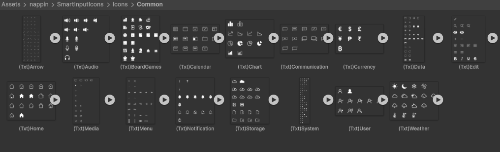
Common: Provides a variety of useful development icons beyond input, including audio symbols, system controls, and notification icons. Ideal for menus, settings, and general UI feedback.
The sprites are structured so that icons can be customized, and the library can be extended with additional assets if needed.
TextMeshPro Sprite Assets
Sprite Assets are the resources used by TextMeshPro to insert icons directly into text.
They are required by the Text Icon Swapper and are built from the sprites described in the previous section.
If new icons are added to the sprite collections remember to update the corresponding Sprite Assets.
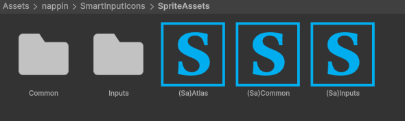
The structure of the SpriteAssets folder mirrors the Icons folder. Content is distributed into three parts:
-
Inputs: Sprite Assets that reference all device input icons for PC, Xbox, PlayStation, and Switch.
-
Common: Sprite Assets that reference the icon library such as audio, system, and notification symbols.
-
Root: Three master Sprite Assets are included here—one containing all Inputs, one containing all Common icons, and one called Atlas that includes everything. The
Text Icon Swappercan always use the full Atlas, but if a very large number of custom icons is added, using the more specific Sprite Assets is recommended for efficiency.
Icon Mapping
One of the most powerful features of Smart Input Icons is that input mapping is centralized.
There is no need to configure each individual icon in each Image Icon Swapper and Text Icon Swapper, the mapping system handles it all.
If needed, multiple mappings can be created to support different gameplay states or control schemes.
A new mapping can be created from the Project window via Right Click → Create → InputIcons → Mapping.
The structure is straightforward: entries can be added or removed as required.
Each entry defines how an input action should be displayed across devices. Each entry contains the following fields:
-
Input ID: The unique name of the entry. This is used by the
Image Icon SwapperandText Icon Swapperto reference the correct mapping. -
Device Icons: Lists of icons for the various inputs like PC, Xbox, PlayStation, and Switch, each with a preview. Multiple icons can be assigned per action if needed.
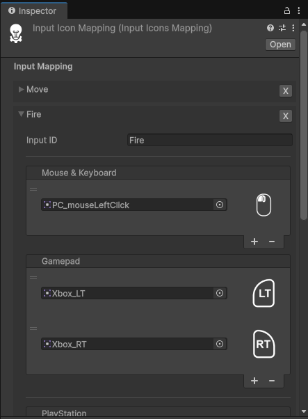
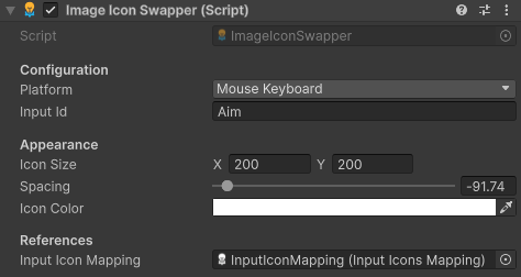
Image Icon Swapper
The Image Icon Swapper works both in the Editor and at runtime.
Its role is to instantiate Image children and configure them according to the variables set in the inspector.
This makes it possible to display input icons dynamically without manually placing sprites in the UI.
If icons do not refresh immediately in the Editor, they can be updated by pressing Shift + G or through the dropdown menu.
Variables
-
Platform: Defines which platform icons to use. In both Play Mode and Edit Mode, the icon shown corresponds to the platform selected here. It does not change automatically with the active input device unless an
UpdateInputIconsis in the scene. -
Input ID: References the name of the entry inside the Input Icon Mapping. This determines which action’s icon is displayed.
-
Icon Size: Sets the width and height of the generated icon in pixels (X and Y).
-
Spacing: Controls the spacing offset between icons when multiple icons are shown.
-
Icon Color: Applies a tint color to the displayed icon.
-
Input Icon Mapping: The reference to the mapping asset used to resolve which icon to display. Without this, the swapper cannot retrieve icons.
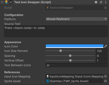
Text Icon Swapper
The Text Icon Swapper works both in the Editor and at runtime.
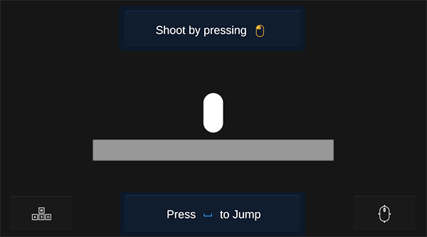
It replaces placeholders inside a text with the correct input icons.
The script is attached to a TextMeshPro component, which can still be edited normally,
but its content will be overridden by the value of Source Text.
To display icons, the grammar <input=InputId> must be used,
where InputId matches an entry in the Input Icon Mapping.
If icons do not refresh immediately in the Editor, they can be updated by pressing Shift + G or through the dropdown menu.
Variables
-
Platform: Defines which platform icons to use. In both Play Mode and Edit Mode, the icon shown corresponds to the platform selected here. It does not change automatically with the active input device unless an
UpdateInputIconsis in the scene. -
Source Text: The raw text that the component uses to generate the final output. Placeholders in the form
<input=InputId>are replaced with the corresponding icons. -
Icon Color: Sets the tint color applied to inserted icons.
-
Icon Size Percent: Scales the icons relative to the surrounding text size.
-
Spacing: Controls the horizontal gap between icons and surrounding text, as well as between multiple icons.
-
Vertical Offset: Adjusts the vertical alignment of icons relative to the text baseline.
-
Text Between Icons: Optional string placed between multiple icons, e.g. “or”.
-
Input Icon Mapping: The mapping asset that links Input IDs to their icons.
-
Sprite Asset: The TextMeshPro Sprite Asset used to render the icons in text.
Singleplayer & Multiplayer
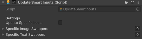
The Update Input Icons component is responsible for refreshing all Image Icon Swappers
and Text Icon Swappers at runtime whenever the active input device changes.
Without this component in the scene, icons will not update dynamically.
Variables
-
Update Specific Icons: If disabled, all swappers in the scene are updated automatically. If enabled, only the swappers explicitly assigned below are updated.
-
Specific Image Swappers: A list of
Image Icon Swappersto update if Update Specific Icons is true. -
Specific Text Swappers: A list of
Text Icon Swappersto update if Update Specific Icons is true.
Usage
-
Singleplayer: In this case there is no need to enable Update Specific Icons, and a single
Update Input Iconscomponent is enough for the entire scene. The refresh is handled through the methodOnControlsChanged, which can be linked in the Inspector to the Controls Changed Event of the PlayerInput component. When Unity detects that the active input device has changed, this connection ensures that all icons are updated automatically.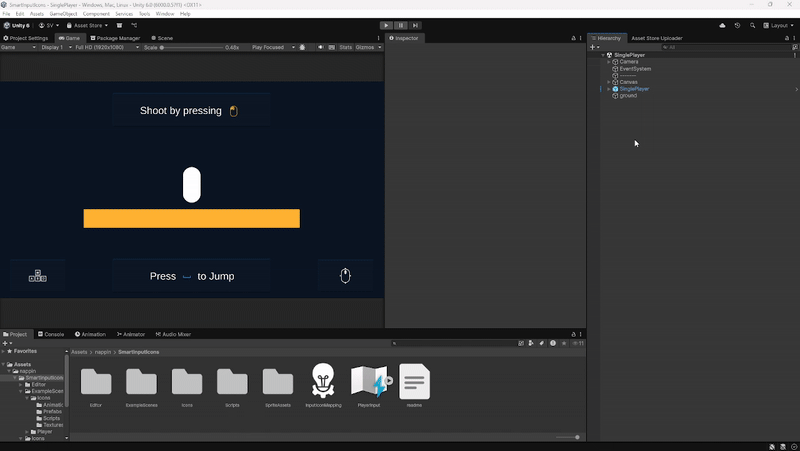
-
Multiplayer: In this case it is recommended to enable Update Specific Icons. Each player can have their own
Update Input Iconscomponent, configured with references to that player’s Image Swappers and Text Swappers. As with singleplayer, the refresh is handled by theOnControlsChangedmethod, which can be linked to the Controls Changed Event of each player’s PlayerInput. This way, whenever a player changes device, only the icons related to that player are updated.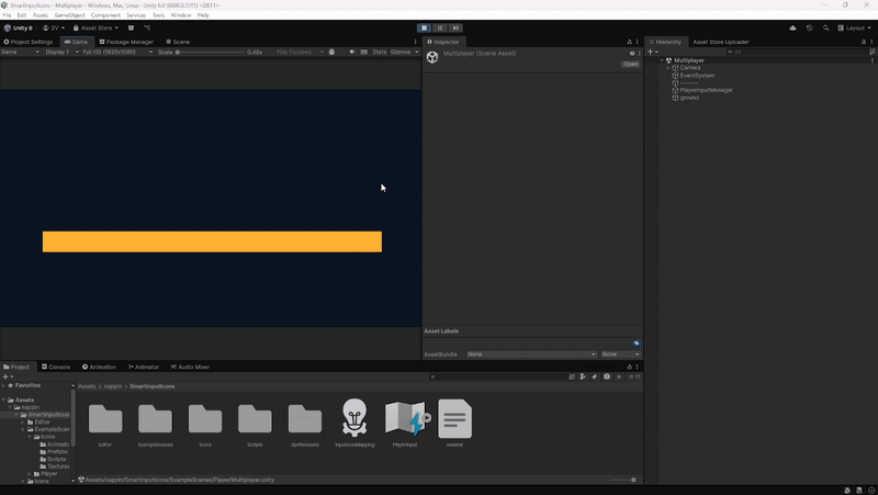