Mobile Controller Framework
Unity Asset
Mobile Controller Framework is a set of customizable mobile input types ready to use out of the box.
Compatible with Unity 6, 2023.2, 2022.3 LTS, and 2021.3 LTS it works with both the Old Input System
and New Input Systems via Unity’s IPointer events, and supports Built-in, URP, and HDRP pipelines with no extra setup.
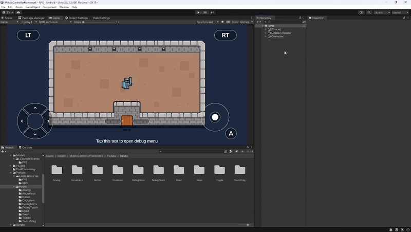
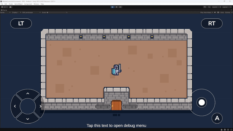
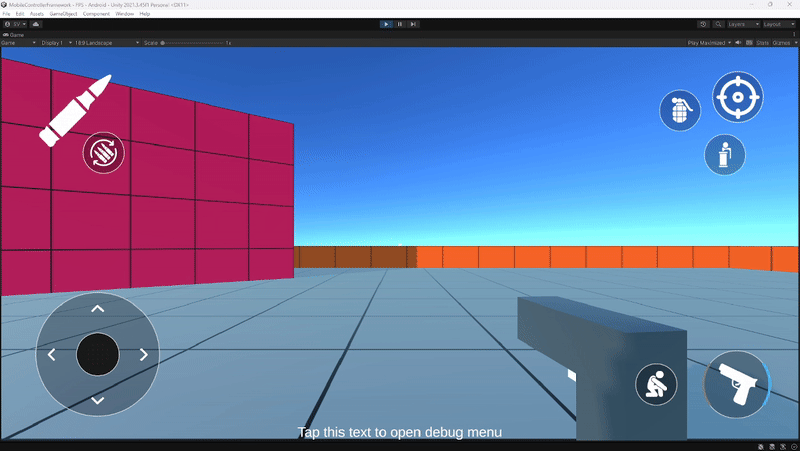
The asset includes two sample scenes and core content organized into the Prefabs/Input folder for quick setup. Widgets include Analog, ArrowKeys, Button, Cooldown, DebugMenu, Dpad, Swap, Toggle, Touch and TouchDrag.

External Packages
Mobile Controller Framework does not requires external packages. TextMeshPro is recommended for rendering text but can be replaced with Unity’s default Text component or any other text renderer.
If you want to use Unity’s New Input System, you will need to install the official Input System package. The framework is fully
compatible, allowing seamless integration without additional code changes.

Input Setup
If you are using the Old Input System, simply create an EventSystem in your scene.

If you are using the New Input System, first import the Input System package via the Unity Package Manager.
Then instantiate an EventSystem in your scene and enable the Upgrade option to ensure compatibility.
Widgets Structure
All Input Types in the framework share a consistent structure:
-
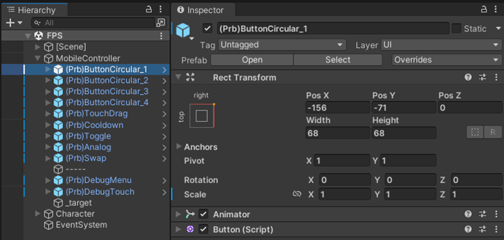
Animator: Each Input Type’s visuals are controlled by an Animator component. Editing the animations for different states (Normal, Tap, Disabled, etc.) is straightforward, and you can also create custom Animators with your own animations.
-
Input Components: Every Input Type uses a dedicated input component, which can always be found inside the Input Type prefab parent.
-
Target Content: Input detection and visuals are separated. Input detection is handled by a transparent image, while the visual representation is managed independently. This separation makes customizing behavior and setting dead zones much easier.

-
Special Children: Some Input Types—such as Dpad, ArrowKeys, and Swap—include special child objects. Details are covered in the following sections.
Button Widget
The Button Widget uses an interactable area to detect whether the player performs a tap or a hold. The tool includes three variants of the Button, but all variants share the same functionality and can trigger the same actions. The Button Component exposes variables, events, and methods to control its behavior and respond to player input.
Variables
-
Initial State: Sets the starting state of the button. Can be Normal or Disabled.
-
Hold Time Threshold: The duration required to register a Hold input.
-
Enable Hold: Determines whether the button can recognize a Hold input.

Events and Methods
-
Tap Start Event: Triggered when the player begins a Tap.
-
Tap End Event: Triggered when the player releases a Tap.
-
Hold Start Event: Triggered when the player begins an Hold.
-
Hold End Event: Triggered when the player ends an Hold.
-
Enable Event: Called when the button is enabled via code.
-
Disable Event: Called when the button is disabled via code.
-
GetButtonState(): Returns the Button current state. -
Enable(): Enables the Button events, making it interactible. -
Disable(): Disable the Button events, making it not interactible.
Dpad Widget
The Dpad Widget uses 8 interactable areas (4 cardinal and 4 diagonal) to generate a
Vector2Int based on the player’s input.
The Dpad contains 8 child elements in its hierarchy, each one managed by a Direction Component.
The Dpad Component exposes variables, events, and methods to control its behavior and respond to player input.
Variables
-
Initial State: Defines the starting state of the Dpad. Can be Normal or Disabled.
-
Up Direction: Reference to the Direction Component used to detect Up.
-
Right Direction: Reference to the Direction Component used to detect Right.
-
Down Direction: Reference to the Direction Component used to detect Down.
-
Left Direction: Reference to the Direction Component used to detect Left.
-
Up Right Direction: Reference to the Direction Component used to detect Up-Right.
-
Up Left Direction: Reference to the Direction Component used to detect Up-Left.
-
Down Right Direction: Reference to the Direction Component used to detect Down-Right.
-
Down Left Direction: Reference to the Direction Component used to detect Down-Left.

Events and Methods
-
Up Tap Event: Triggered when the Up Direction is pressed.
-
Up Exit Event: Triggered when the Up Direction is released.
-
Right Tap Event: Triggered when the Right Direction is pressed.
-
Right Exit Event: Triggered when the Right Direction is released.
-
Down Tap Event: Triggered when the Down Direction is pressed.
-
Down Exit Event: Triggered when the Down Direction is released.
-
Left Tap Event: Triggered when the Left Direction is pressed.
-
Left Exit Event: Triggered when the Left Direction is released.
-
Enable Event: Called when the Dpad is enabled via code.
-
Disable Event: Called when the Dpad is disabled via code.
-
GetDpadDirection(): Returns the currentVector2Intdirection of the Dpad. -
GetDpadState(): Returns the currentDpadStateof the Dpad. -
Enable(): Enables the Dpad, making it interactible. -
Disable(): Disables the Dpad, preventing interaction.
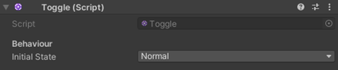
Toggle Widget
The Toggle Widget uses an interactable area to detect whether the player performs a Tap. Once tapped, the state of the Toggle flips between On and Off. The Toggle Component exposes variables, events, and methods to control its behavior and respond to player input.
Variables
-
Initial State: Defines the starting state of the Toggle. Can be Normal or Disabled.
Events and Methods
-
Toggle Event: Triggered whenever the Toggle state flips between On and Off.
-
Enable Event: Called when the Toggle is enabled via code.
-
Disable Event: Called when the Toggle is disabled via code.
-
GetToggleState(): Returns the Toggle current state. -
Enable(): Enables the Toggle events, making it interactible. -
Disable(): Disables the Toggle events, making it not interactible.
ArrowKeys Widget
The Arrow Keys Widget uses 4 interactable areas (all cardinal) to generate a
Vector2Int based on the player’s input.
The Arrow Keys contain 4 child elements in their hierarchy, each one managed by a Key Component.
The Arrow Keys Component exposes variables, events, and methods to control its behavior and respond to player input.

Variables
-
Initial State: Defines the starting state of the Arrow Keys. Can be Normal or Disabled.
-
Up Key: Reference to the Key Component used to detect Up.
-
Right Key: Reference to the Key Component used to detect Right.
-
Down Key: Reference to the Key Component used to detect Down.
-
Left Key: Reference to the Key Component used to detect Left.

Events and Methods
-
Up Tap Event: Triggered when the Up Key is pressed.
-
Up Exit Event: Triggered when the Up Key is released.
-
Right Tap Event: Triggered when the Right Key is pressed.
-
Right Exit Event: Triggered when the Right Key is released.
-
Down Tap Event: Triggered when the Down Key is pressed.
-
Down Exit Event: Triggered when the Down Key is released.
-
Left Tap Event: Triggered when the Left Key is pressed.
-
Left Exit Event: Triggered when the Left Key is released.
-
Enable Event: Called when the Arrow Keys are enabled via code.
-
Disable Event: Called when the Arrow Keys are disabled via code.
-
GetArrowKeysDirection(): Returns the currentVector2Intdirection of the Arrow Keys. -
GetArrowKeysState(): Returns the currentArrowKeysStateof the Arrow Keys. -
Enable(): Enables the Arrow Keys, making them interactible. -
Disable(): Disables the Arrow Keys, preventing interaction.
Analog Widget
The Analog Widget uses the position of a draggable shape (Analog Stick) relative to a background shape
to generate a Vector2.
The Analog Component exposes variables, events, and methods to control its behavior and respond to player input.

Variables
-
Initial State: Defines the starting state of the Analog. Can be Normal or Disabled.
-
Analog Radius: Determines the circumference in which the Analog Stick can move.
-
Stick Return Speed: The speed at which the Analog Stick returns to
(0,0)after release. -
Stick Follow Speed: The speed used by the Analog Stick to reach the touch position.
-
Smooth Stick On Movement: Determines if smoothness is applied to the Analog Stick’s motion.
-
Snap Stick On Click: Determines if the Analog Stick follows the touch from its center or from where the touch occurred.
-
Snap Stick On Release: Determines if the Analog Stick smoothly returns to
(0,0)when released. -
Stick Target: Reference to the Analog Stick GameObject.

Events and Methods
-
Stick Tap Event: Triggered when the Analog Stick is touched.
-
Stick Drag Event: Triggered when the position of the Analog Stick changes.
-
Stick Exit Event: Triggered when the player lets go of the Analog Stick.
-
Enable Event: Called when the Analog is enabled via code.
-
Disable Event: Called when the Analog is disabled via code.
-
GetStickPosition(): Returns the position of the Analog Stick as aVector2. -
GetAnalogState(): Returns the currentAnalogStateof the Analog. -
Enable(): Enables the Analog, making it interactible. -
Disable(): Disables the Analog, preventing interaction.
Heatmap Component
The Heatmap is an additional component that can only be added to a GameObject containing the Analog Component.
It allows the player to visualize the magnitude of the Analog Stick’s Vector2.

-
Transparency Threshold: The magnitude value at which the Heatmap Image stops being fully transparent.
-
Max Alpha: The maximum opacity value the Heatmap Image can reach.
-
Color Gradient: The color range of the Heatmap Image from minimum to maximum magnitude.
-
Stick Target: Reference to the Analog Stick GameObject.
-
Heatmap Parent: The parent object of the Heatmap Image. It should always be centered within the Analog.
-
Heatmap Image: The Image Component used to display the Heatmap magnitude.
Swap Widget
The Swap Widget uses two interactable areas (each containing a Swapper Component) to determine if the player pressed Next or Previous. Depending on the input, the currently active Item is swapped with the one before or after in a list. By default, the package uses a list of Scriptable Objects, but it can easily be customized to fit different needs.

Variables
-
Initial State: Defines the starting state of the Swap. Can be Normal or Disabled.
-
Is Cyclical: Determines if the list loops on both sides. If
true, the player can navigate indefinitely to the left and right. -
Items: The content used inside the Swap.
-
Start Index: The index of the Item considered as the first.
-
Swapper Prev: The Swapper used to select the previous Item.
-
Swapper Next: The Swapper used to select the next Item.
-
Icon Image: The Image Component used to display the current Item.

Events and Methods
-
Swap Event: Triggered when the current Item changes.
-
Enable Event: Called when the Swap is enabled via code.
-
Disable Event: Called when the Swap is disabled via code.
-
GetCurrentItem(): Returns the current Item. -
GetCurrentIndex(): Returns the current Item index. -
GetSwapState(): Returns the currentSwapStateof the Swap. -
Enable(): Enables the Swap, making it interactible. -
Disable(): Disables the Swap, preventing interaction.
Cooldown Widget
The Cooldown Widget uses an interactable area to detect whether the player performs a Tap.
Once tapped, a countdown (with visual feedback) is started.
When the countdown reaches 0, the Cooldown can be tapped again.
The Cooldown Component exposes variables, events, and methods to control timing, visuals, and interaction behavior.

Variables
-
Initial State: Defines the starting state of the Cooldown. Can be Normal or Disabled.
-
Cooldown Time: The duration of the countdown.
-
Enable Text: If
true, a countdown text is displayed. -
Decimal Places: The number of decimal places shown in the countdown text.
-
Enable Fill: If
true, a fill image is displayed during the countdown. -
Fill Mode: Determines fill behavior. Refill means the image fills from 0 to 1, Empty means the image empties from 1 to 0.
-
Fill Type: Specifies the type of fill used (Radial, Horizontal, Vertical).
-
Fill Image: The Image Component used for the fill.
-
Countdown Text: The Text Component used to display the countdown.

Events and Methods
-
Cooldown Start Event: Triggered when the countdown begins.
-
Cooldown End Event: Triggered when the countdown reaches
0. -
Enable Event: Called when the Cooldown is enabled via code.
-
Disable Event: Called when the Cooldown is disabled via code.
-
GetCooldownState(): Returns the currentCooldownStateof the Cooldown. -
GetCooldownTime(): Returns the remaining countdown time. -
ClearCooldown(): Resets the countdown to its initial value, making the Cooldown tappable again. -
Enable(): Enables the Cooldown, making it interactible. -
Disable(): Disables the Cooldown, preventing interaction.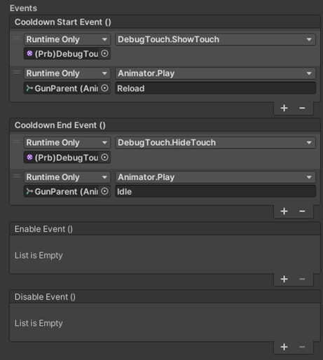
Touch Drag
The Touch Drag input type uses an interactable area to detect when the player touches and drags their finger across the screen.
It calculates the Vector2 distance between the initial touch position and the release position, making it ideal for interactions such as camera pans.
Custom Touch Drag shapes can be easily created using multiple Targets.
The Touch Drag Component exposes variables, events, and methods to control its behavior and respond to player input.
Variables
-
Initial State: Defines the starting state of the Touch Drag. Can be Normal or Disabled.

Events and Methods
-
Touch Start Event: Triggered when the player begins touching the interactable area.
-
Touch End Event: Triggered when the player lifts their finger, ending the drag.
-
Enable Event: Called when the Touch Drag is enabled via code.
-
Disable Event: Called when the Touch Drag is disabled via code.
-
GetTouchDragMovement(): Returns theVector2movement calculated from the drag. -
GetTouchDragState(): Returns the currentTouchDragStateof the Touch Drag. -
Enable(): Enables the Touch Drag, making it interactible. -
Disable(): Disables the Touch Drag, preventing interaction.
Debug Touch
The Debug Touch component is a support tool included in the package to help visualize touch input during development,
especially in the Editor on PC.
It displays the current touch position on screen, allowing developers to debug input interactions.
This component is not required for gameplay functionality and should only be used for debugging purposes.
Only one is needed per scene.
Variables
-
Display Cursor on Move: Determines whether the mouse cursor is visible while simulating a touch in the Editor.
-
Touch Rect: Reference to the
RectTransformrepresenting the debug touch cursor.
Debug Menu
The Debug Menu is a support tool included in the package that can be displayed on both Mobile and PC by performing a double tap.
It provides detailed information on every Mobile Controller Framework widget currently active in the scene.
This component is intended for debugging and development purposes only, and it should not be included in final builds.
The DebugMenu Component is located in the Prompt child of the prefab.

Variables
-
Double Tap Time: The time window in which a double tap must occur to toggle the Debug Menu.
-
Display By Default: Determines whether the Debug Menu is visible when the scene starts.
-
Entry Parent: The
RectTransformcontaining the Debug Menu list entries. -
Entry Type 1: First entry prefab type, used for visual separation in the Debug Menu.
-
Entry Type 2: Second entry prefab type, also used for alternating visual separation.
-
Content: The
GameObjectchild elements of the Debug Menu.